

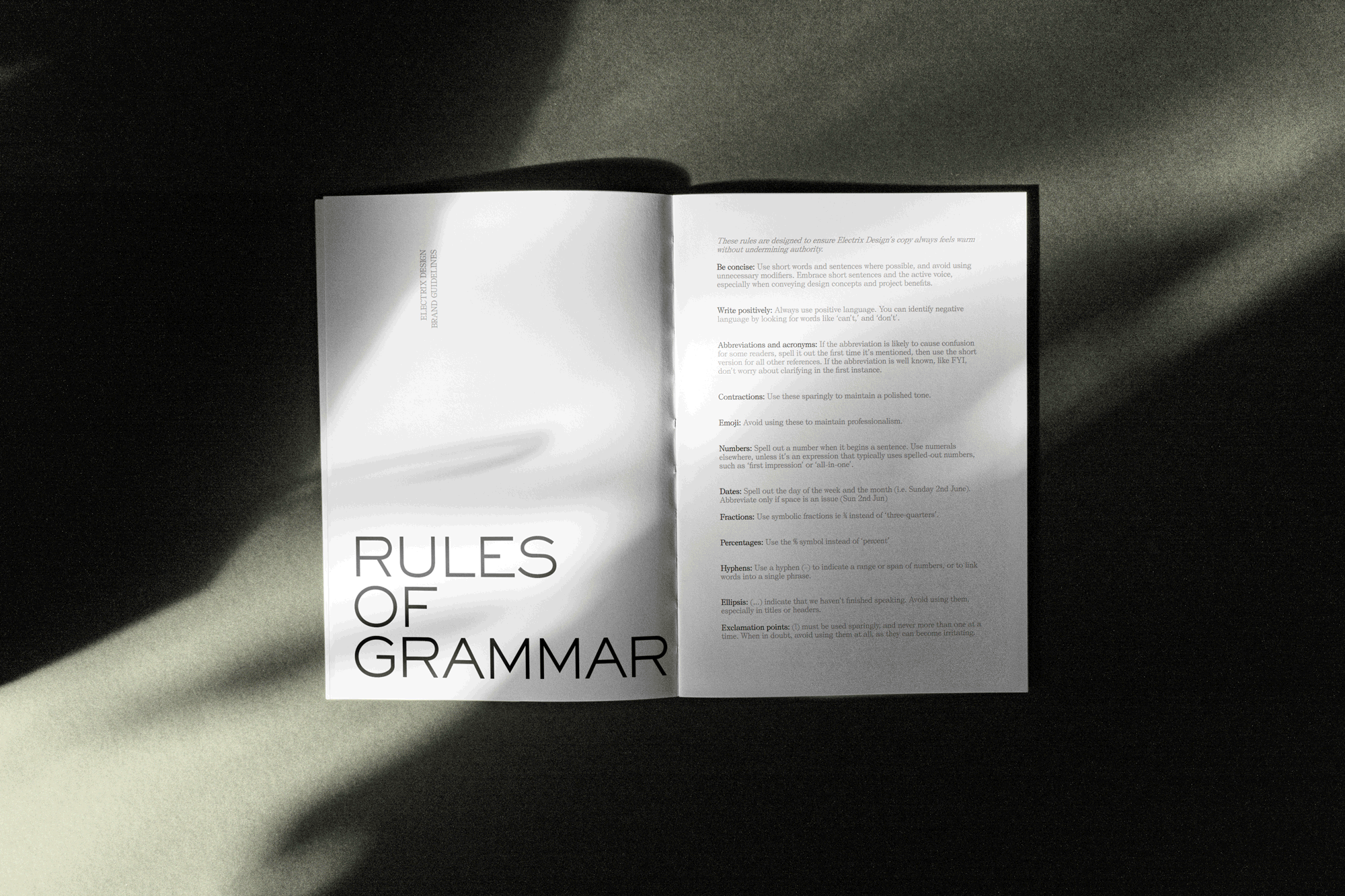
Once we understood what made Electrix Design tick, we moved on to defining how they should sound and feel. We crafted a tone of voice that was sophisticated yet warm—professional without being overly corporate. Their messaging needed to reflect their ability to listen, execute, and create spaces that felt completely tailored to their clients' lives.
We shaped key messaging around their ethos: “Luxury is in the quiet details,” “We are doers. We listen deeply and execute flawlessly,” and “We don’t just design spaces—we create homes, workplaces, and sanctuaries.”
Every line had to reinforce their commitment to precision and personal connection. This was about more than words; it was about making sure every client felt understood and taken care of.

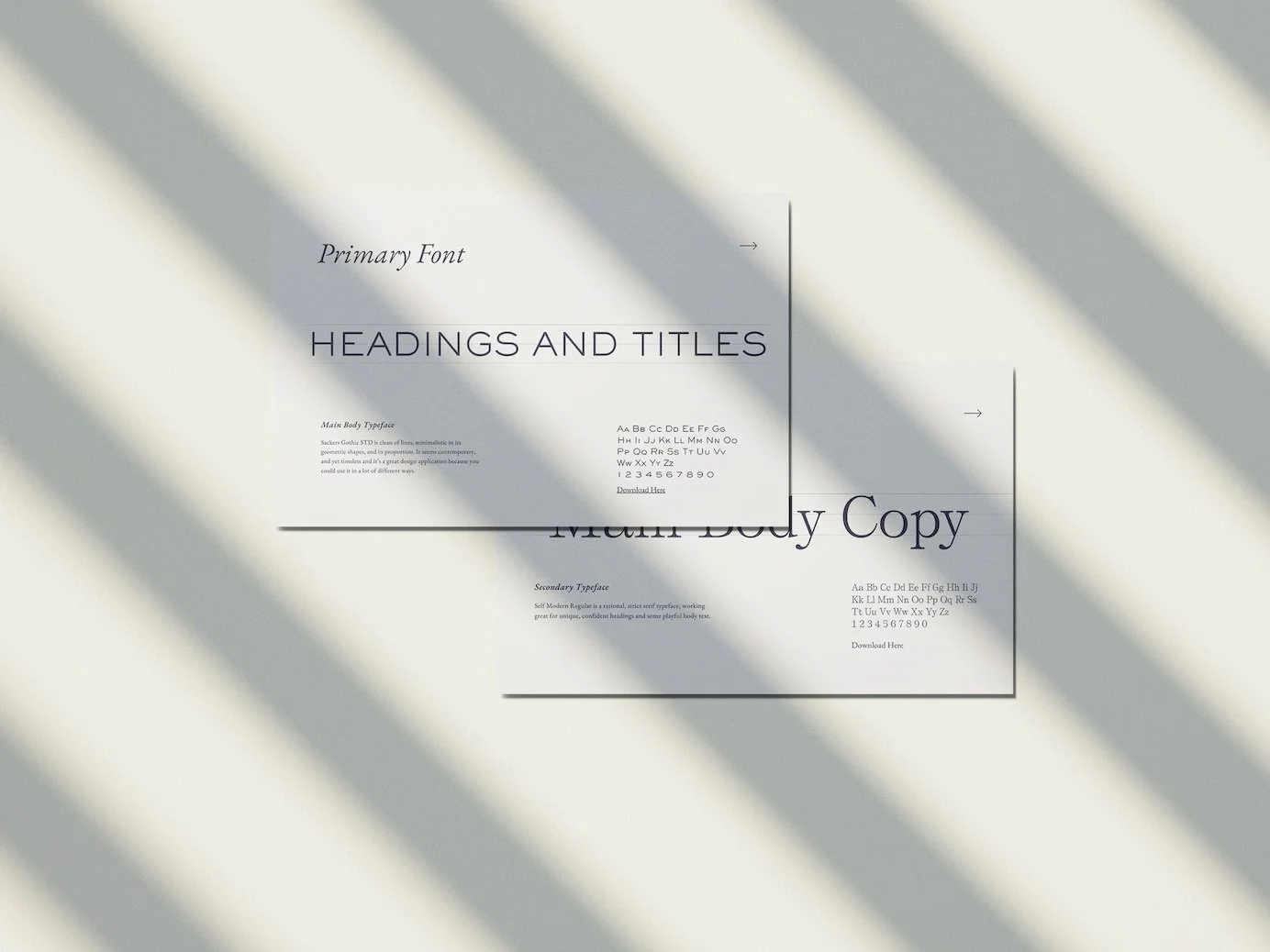
Typography played a major role in refining the brand’s presence.
We selected Sackers Gothic STD as the primary typeface, chosen for its clean lines and timeless geometry—minimal yet confident. It gave the brand a modern, structured feel without veering into cold professionalism.
To balance that, we introduced Self Modern Regular, a serif with a quiet elegance that added warmth and character, perfect for headlines and key brand statements.
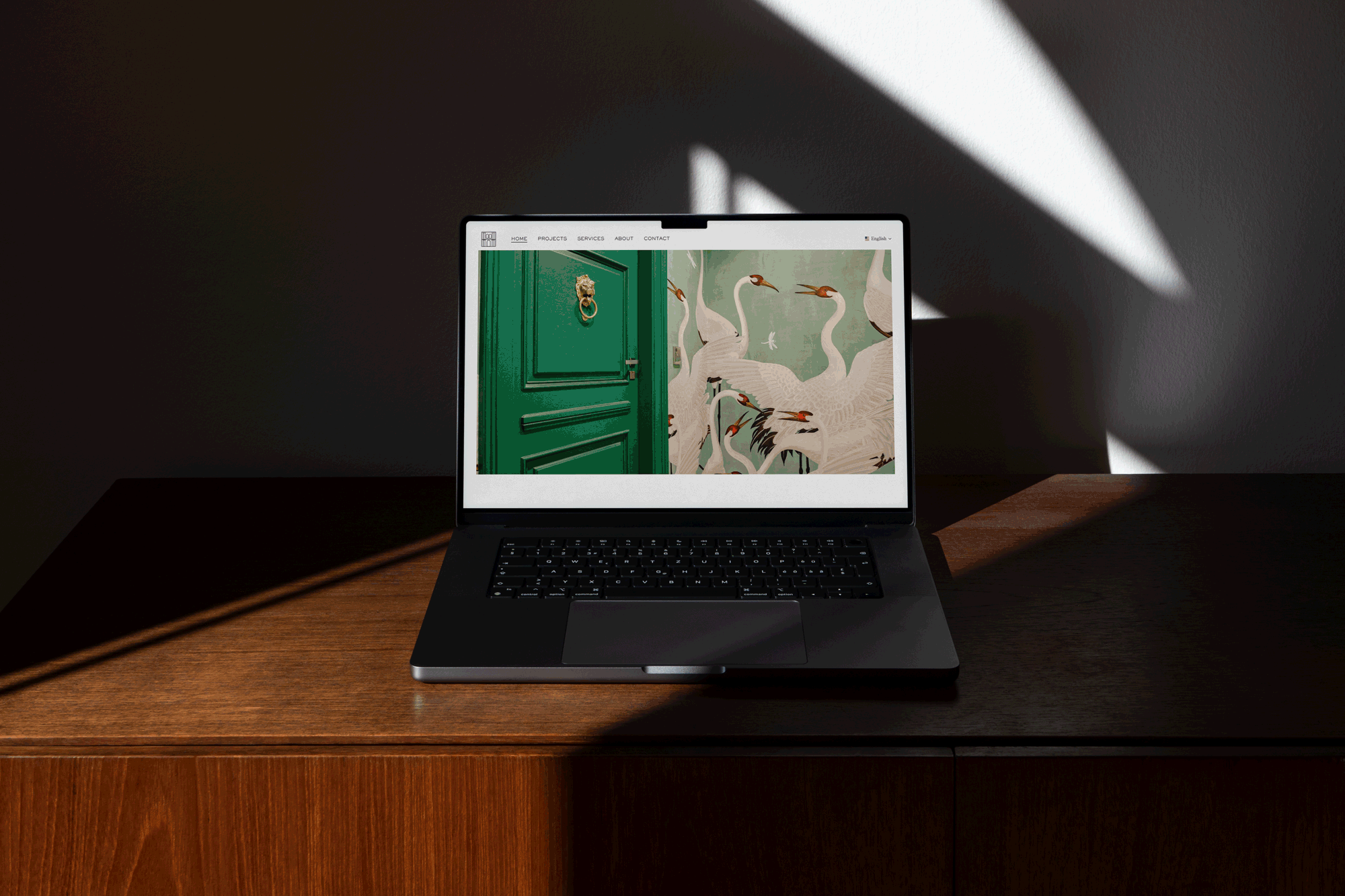
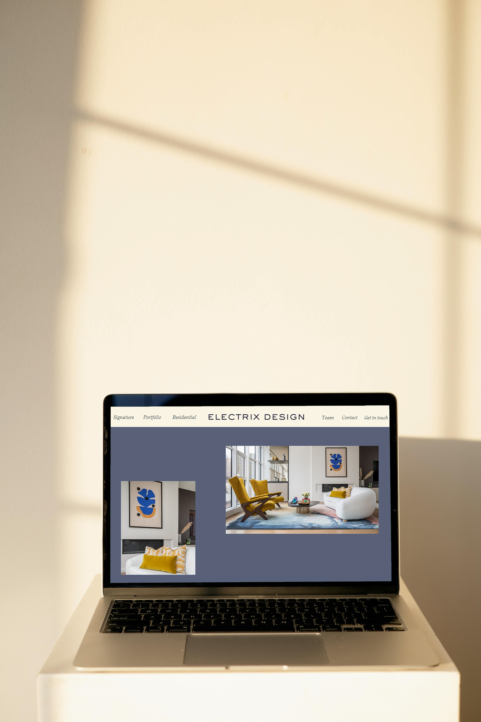
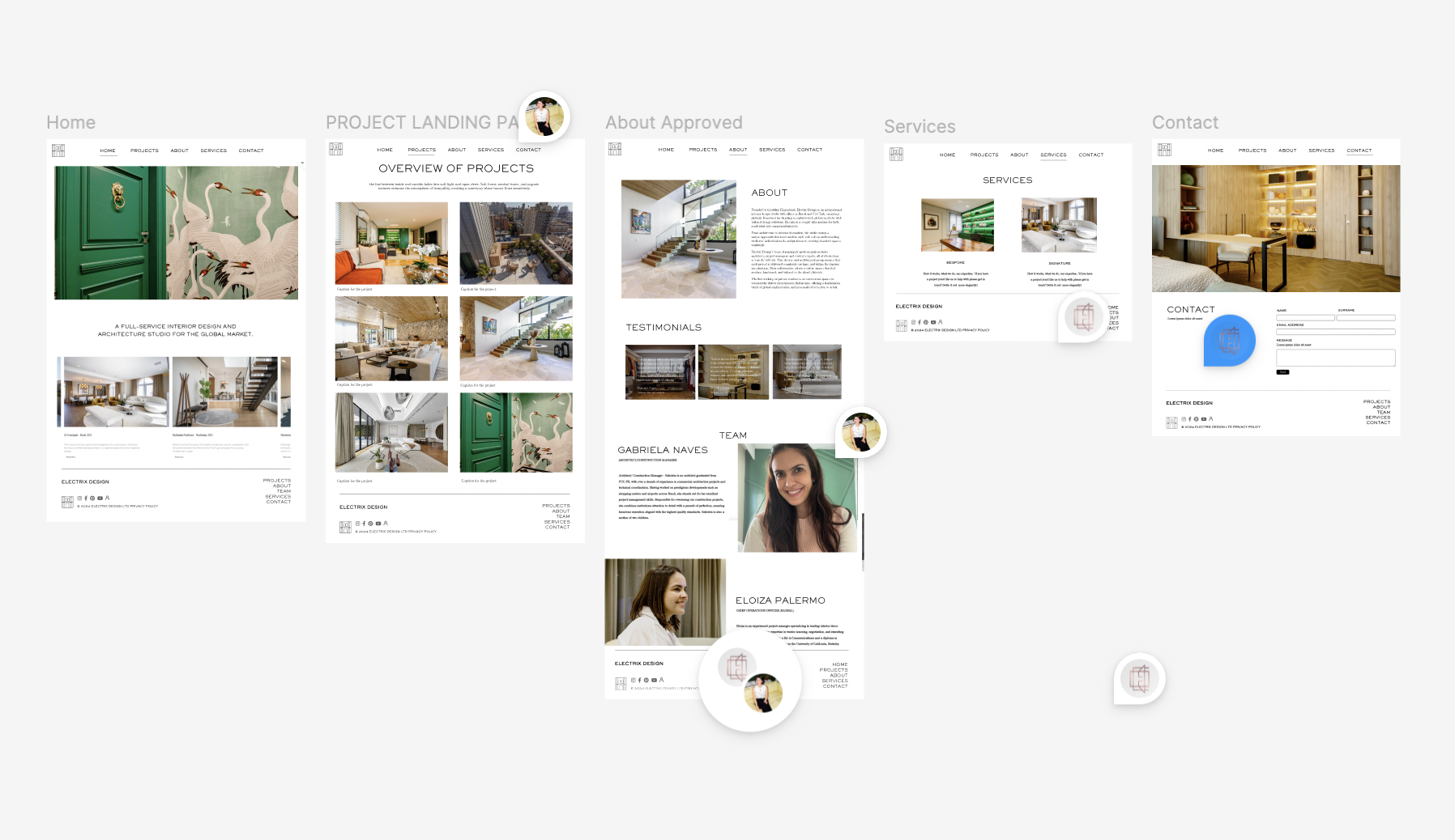
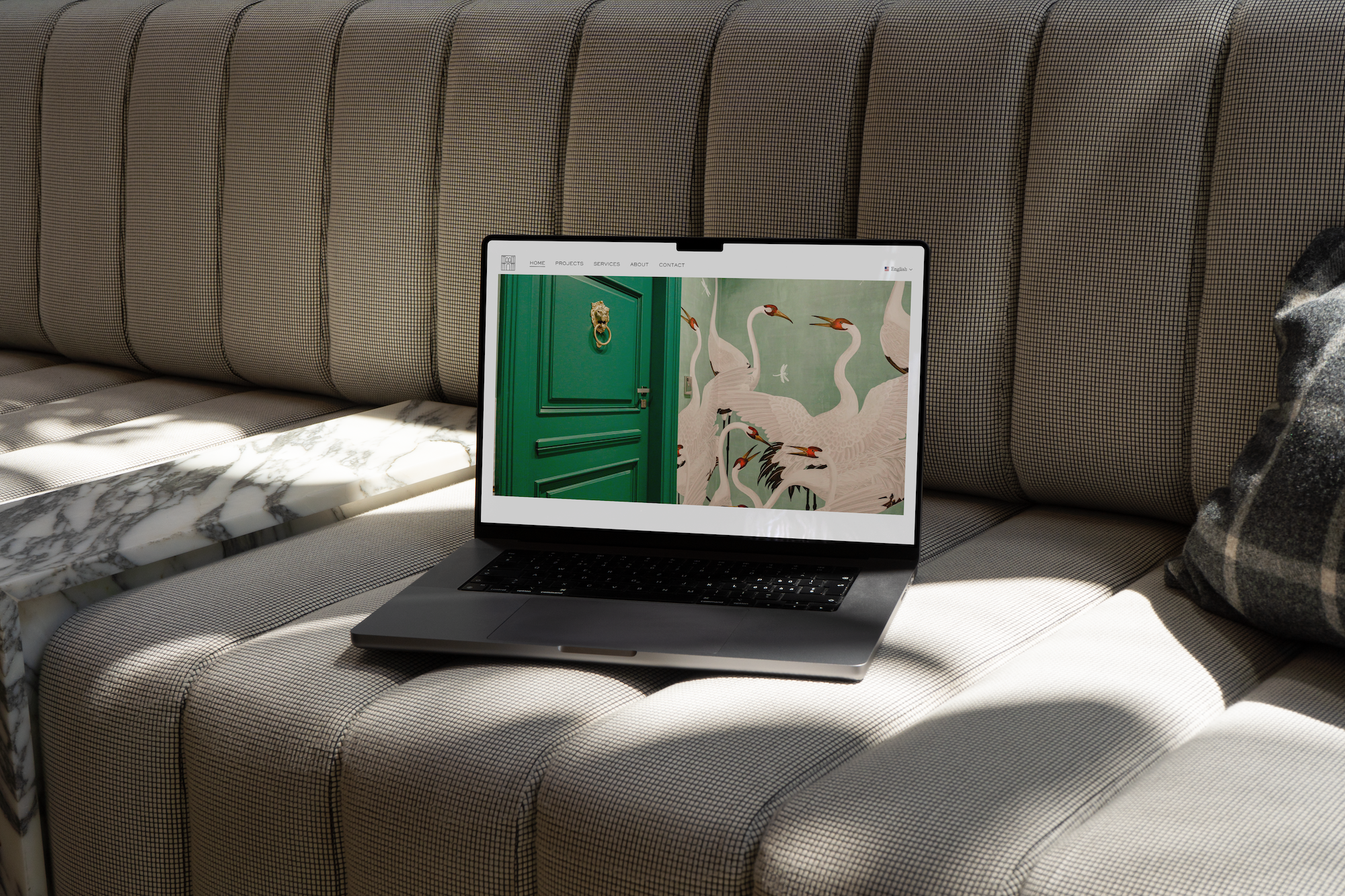
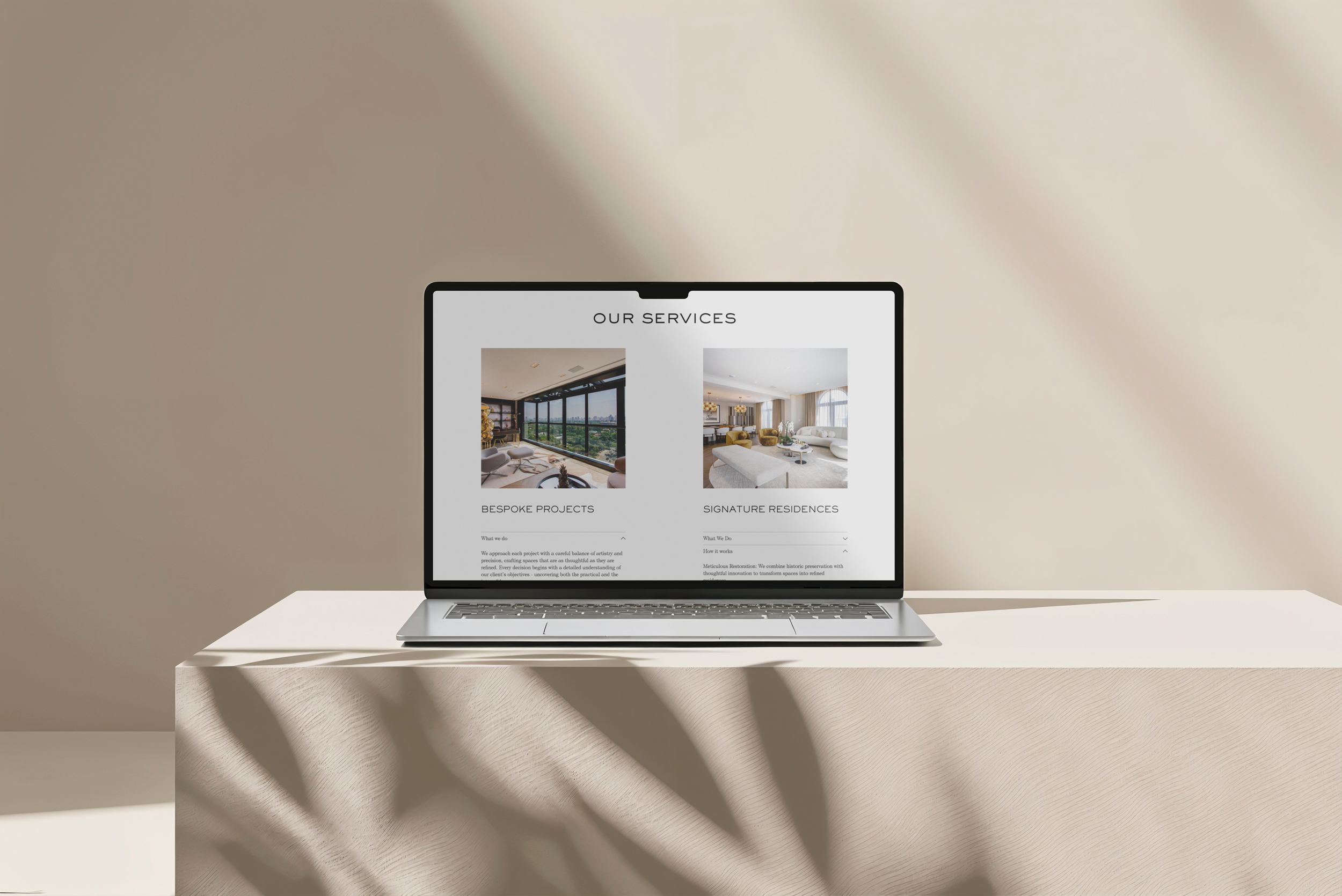
Once the core brand elements were in place, we started translating them into a digital experience. Using Figma, we wireframed the website to ensure it felt as intuitive and effortless as the interiors Electrix Design creates. We focused on clean, spacious layouts that echoed the brand’s design philosophy—nothing cluttered, nothing excessive, just beautifully structured pages that guided users through Electrix’s story and services.
One of our biggest challenges was ensuring the website reflected the full scope of Electrix Design’s expertise. In the US, they do much more than interior design—they solve their clients’ real estate challenges, from full-scale renovations to quick turn-key transformations. We designed sections that clearly outlined these different offerings, ensuring potential clients could quickly understand Electrix’s value.
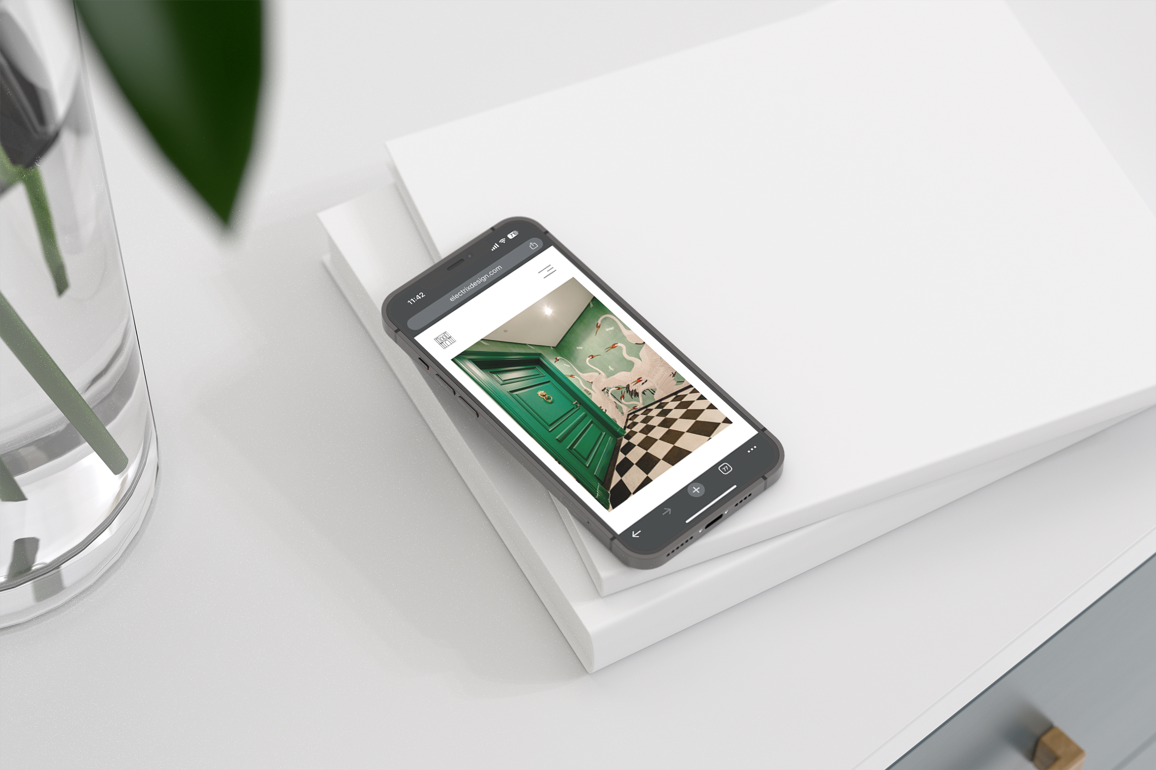
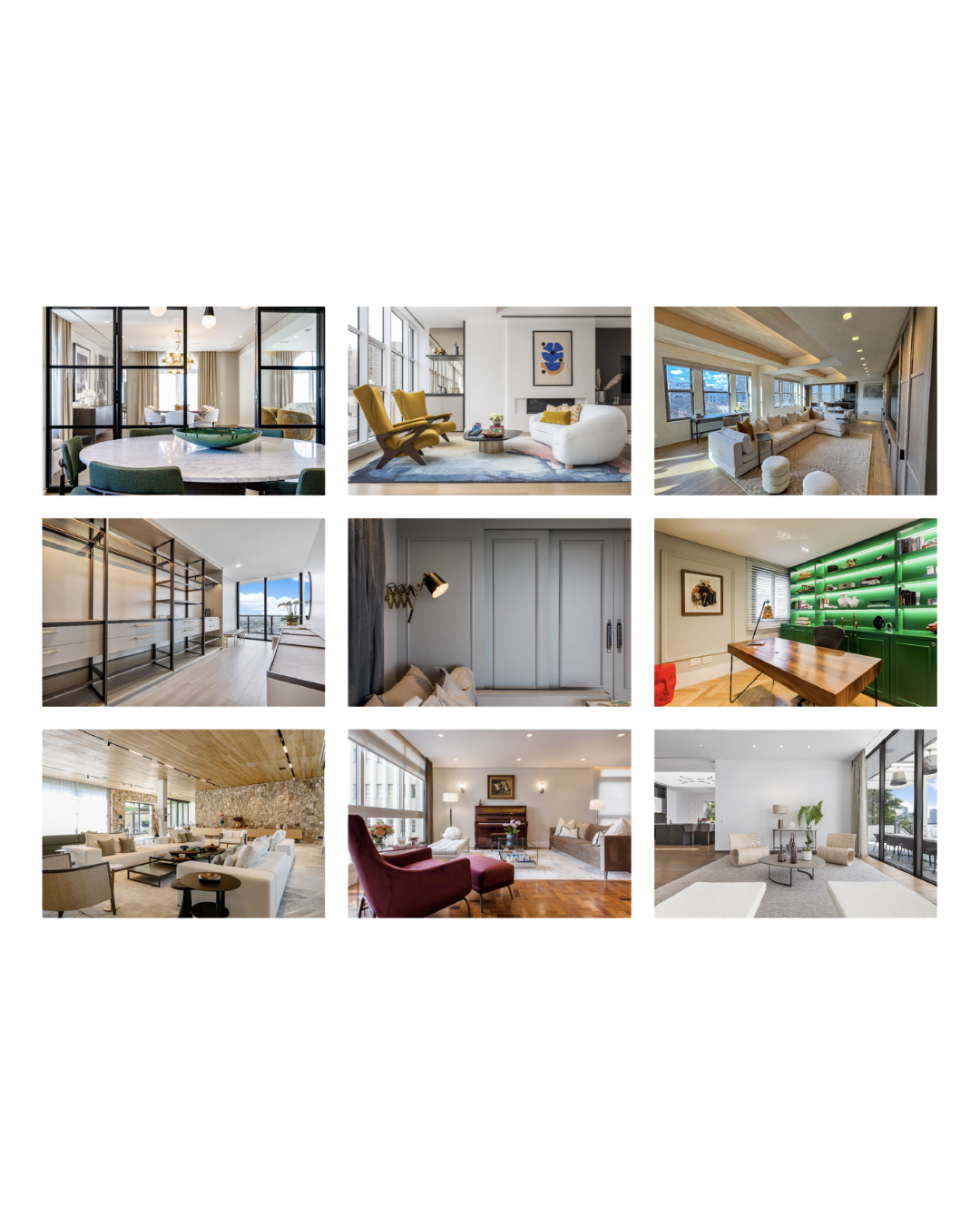
With the wireframes approved, we moved into the build phase. The website needed to be as polished and effortless as Electrix Design’s approach—visually stunning, easy to navigate, and rich with personality. We worked closely with their team to refine the copy, selecting images that captured both the grandeur and intimacy of their work. Every detail, from the hover states to the transitions between pages, was designed to feel smooth and elegant, reinforcing the brand’s attention to craftsmanship.
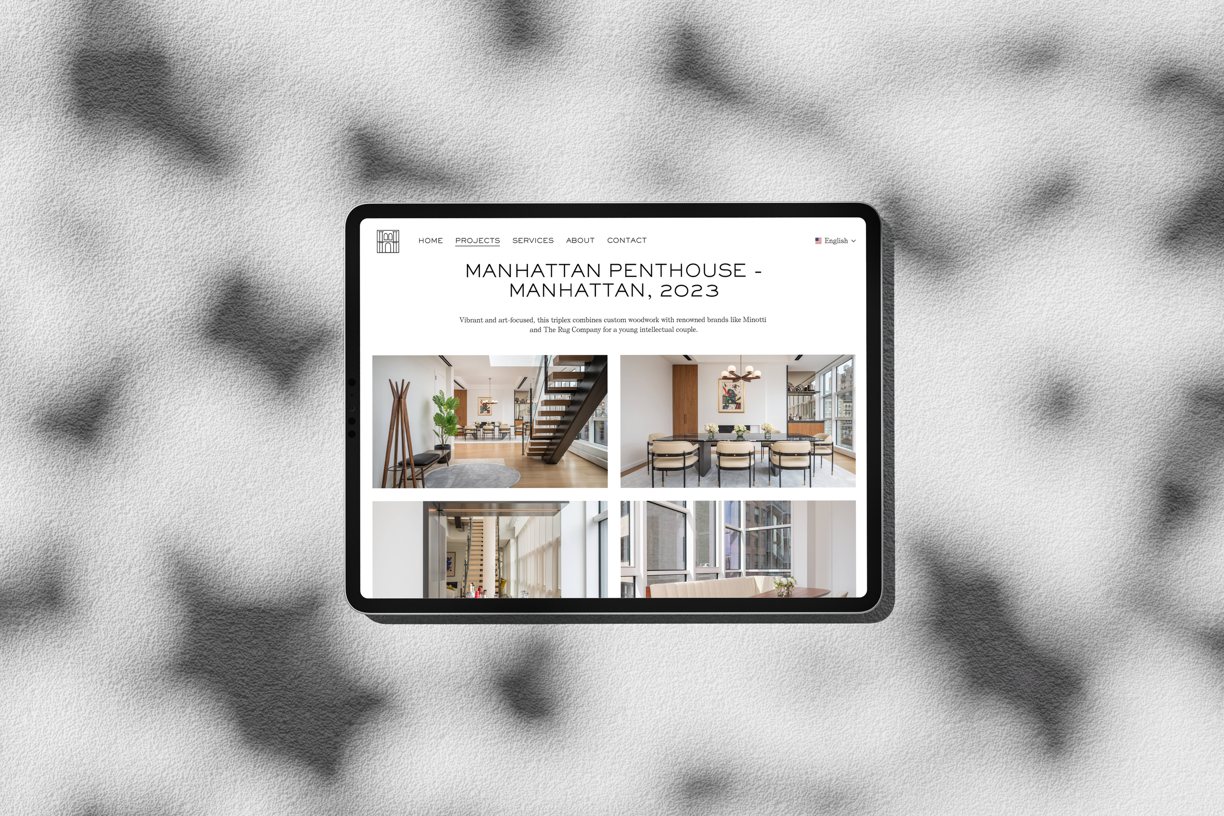
We also built in a storytelling approach to the case studies, allowing users to see the transformation process behind each project. Rather than just showing before-and-after shots, we crafted narratives around each home, highlighting the client’s vision, the challenges, and how Electrix Design brought everything to life. The goal was to create an experience that felt immersive and inspiring, making visitors feel like they were stepping into a world where every detail was considered.

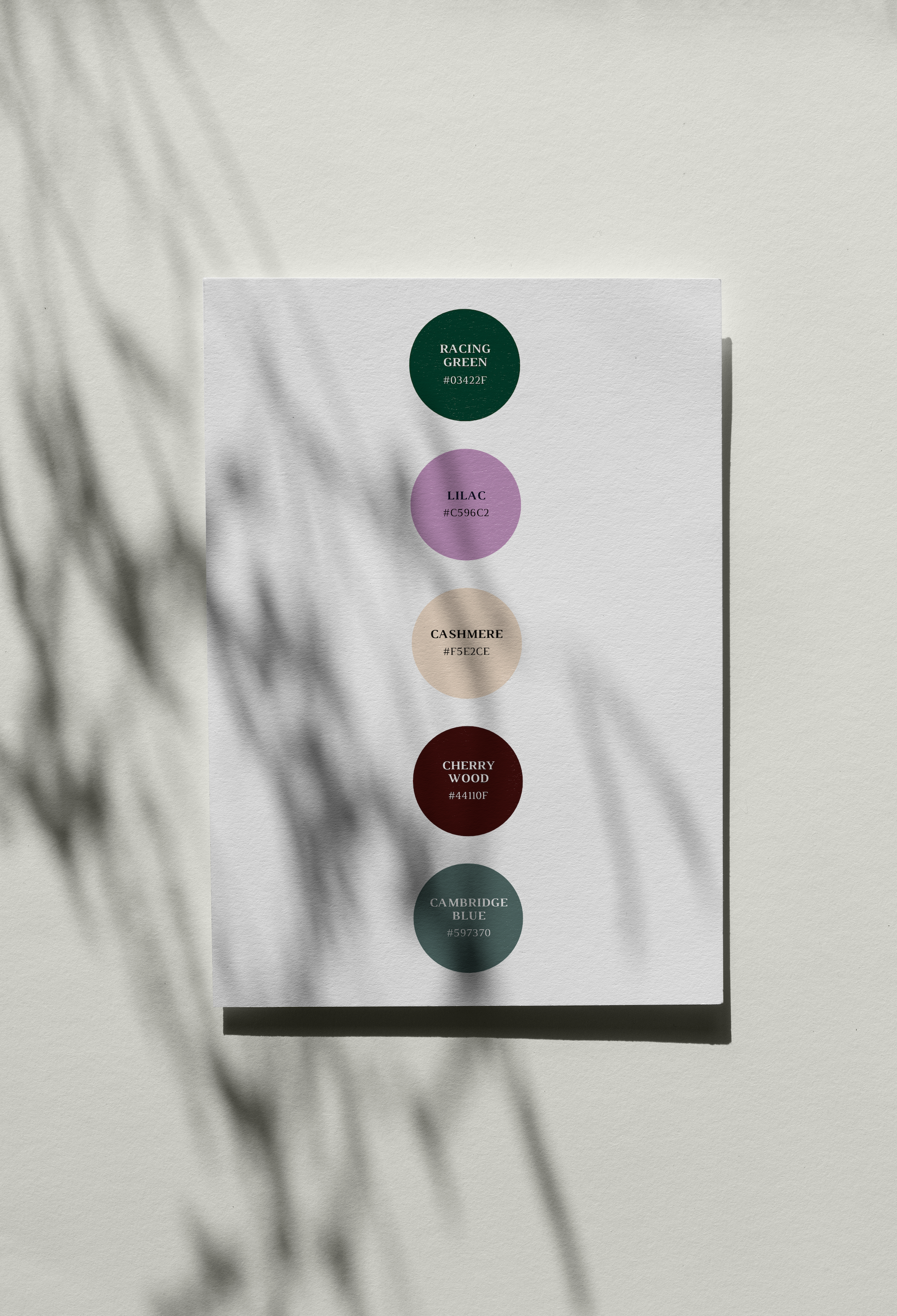
Color was another key tool in conveying sophistication and trust. We developed a refined palette that reflected the brand’s global, cultured aesthetic.
Racing Green, a deep and distinguished tone, anchored the palette, embodying heritage and timeless elegance.
Lilac introduced a creative, artistic energy, while Cashmere softened the edges with a warm, neutral tone.
Cherry Wood grounded everything with a rich, organic depth, and Cambridge Blue provided a fresh contrast, symbolizing clarity and balance.
From the outset, we knew this wasn’t about a flashy rebrand. It was about clarity and cohesiveness. Electrix Design needed a strong, confident brand that reflected their expertise while remaining warm and approachable. They weren’t in the business of creating distant, untouchable luxury—they crafted homes that were both elegant and inviting. That balance had to come through in every aspect of their new brand.

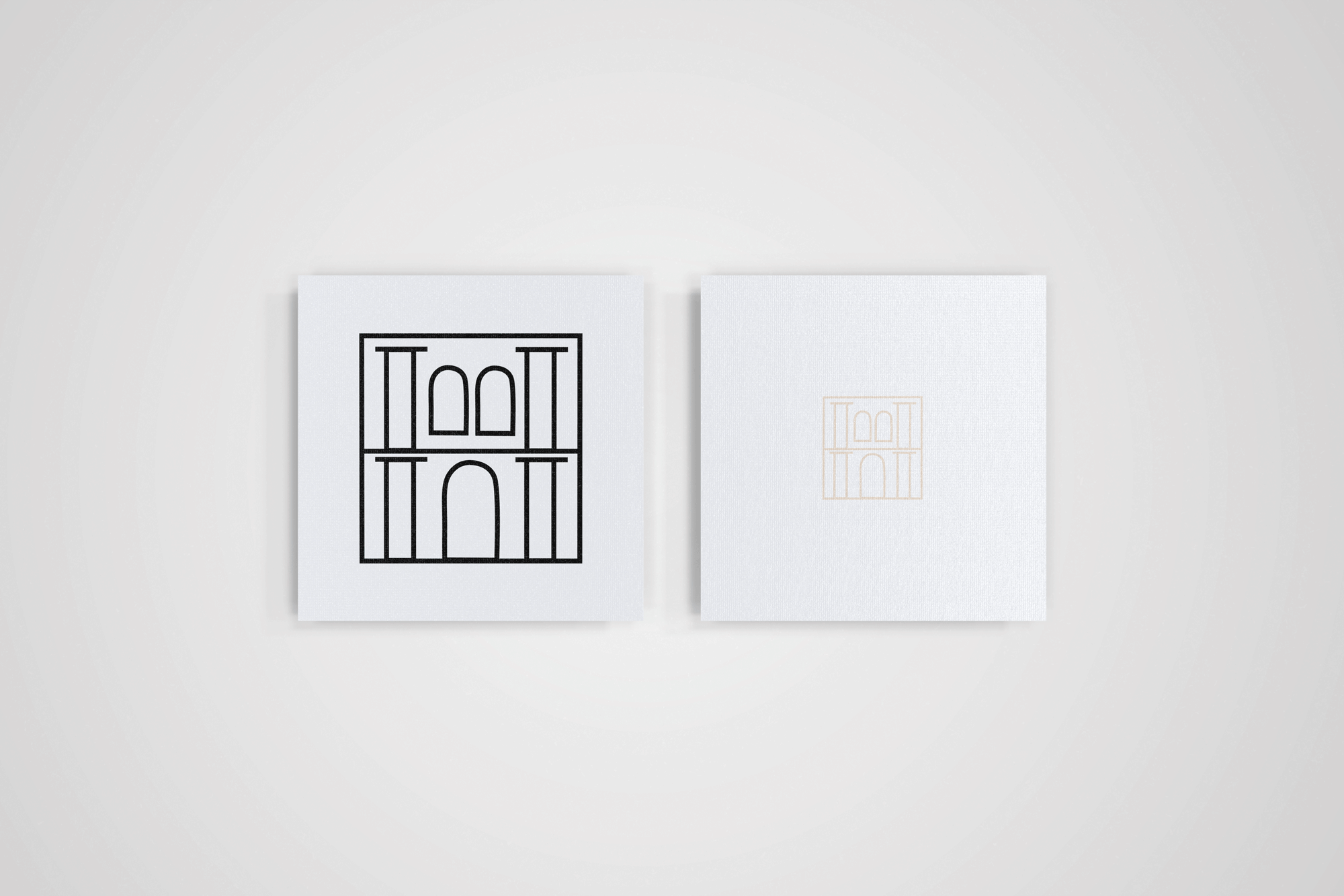
With the brand’s personality clearly defined, we turned our attention to its visual identity. This was where we needed to strike the perfect balance—luxury without excess, exclusivity without intimidation. We created a logomarque that subtly incorporated geometric forms to represent a palatial interior. The fine-line iconography evoked a sense of grandeur and structure, reinforcing Electrix Design’s ability to craft spaces that felt both expansive and intimate.
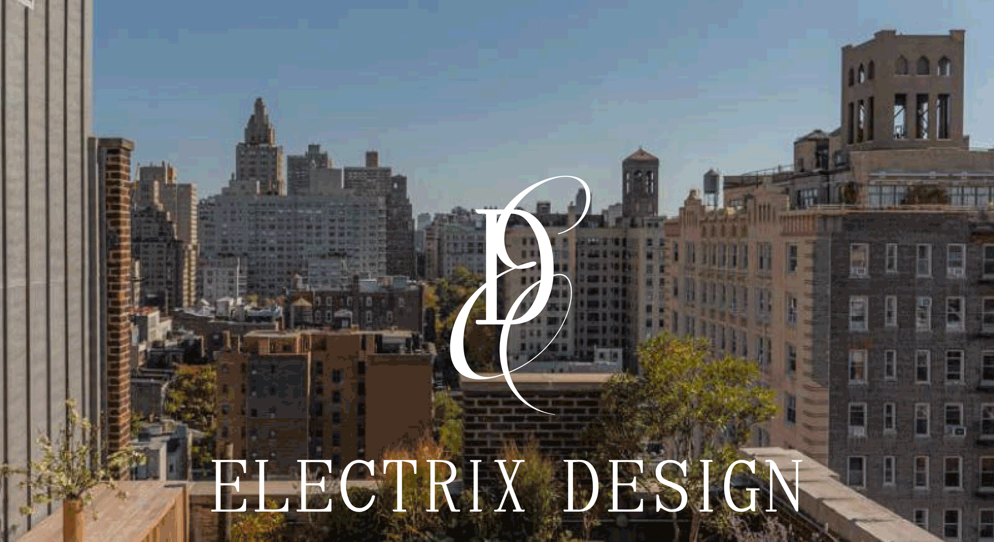
When Electrix Design approached us, they had already made a name for themselves in the world of luxury interiors. Founded by Geraldine Hagenbuch, the studio had built a reputation for creating stunning, move-in-ready residences, blending global aesthetics with deeply personal touches. But their website didn’t quite match the caliber of their work. They needed something sharper, clearer - a brand and online presence that felt as seamless and refined as the spaces they designed.
Our first step was to get under the skin of Electrix Design. We sat down with Geraldine and her team, diving into their ethos, their ambitions, and, crucially, their challenges. They weren’t just another interior design firm—they were problem-solvers, working at the intersection of real estate, lifestyle, and high-end design. Their clients weren’t just looking for beautiful spaces; they needed seamless execution, impeccable taste, and a team they could trust to handle everything.
Services: Strategy, brand identity including logo, colour palette, typography, website design and
tone of voice guidelines. Interested in a rebrand? Get in touch for a quote!