“It was important to have a visual brand that aligned with my vision for March Women. The process with Alexandra was very collaborative and end result truly represents our ethos of action, community and progression”
––Laura Brunnen, Founder, March Women
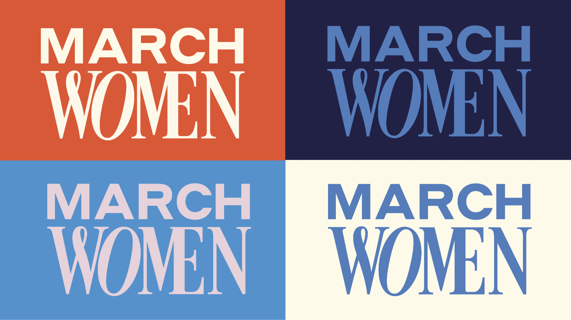
To contrast, we introduced an electric pop of coral. This vibrant, energetic colour serves as a visual representation of the group's vibrancy. The coral stands out, symbolising the bold, decisive action, a colour that commands attention and signals a readiness to challenge the status quo. These colours create a palette, mirroring the balance March Women strikes between thoughtful strategy and bold action.
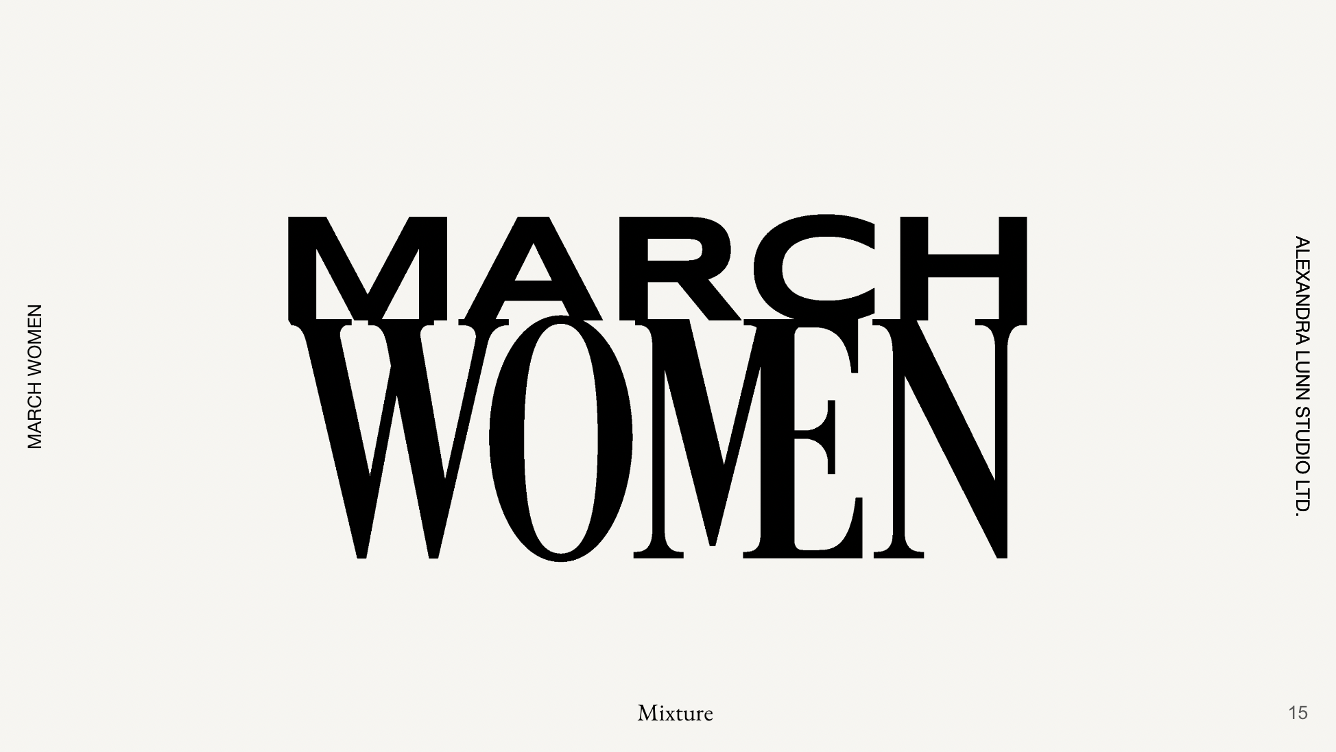
Laura opted for the logotype above, titled 'mixture'. The swirly W and ME in the final type study above communicate how the brand works collaboratively; the leaning O is about progress and pushing forward.
Once the logotype had been established, we moved on to colour palettes. Monochromatic blues develop a foundation of trust and professionalism; we chose them to form the foundation of this palette, representing different aspects of the brand's core values. Lighter blues evoke a sense of clarity and calmness, whereas deeper blues convey a sense of seriousness, resonating with the group's commitment to high stakes and high-impact business dealings.
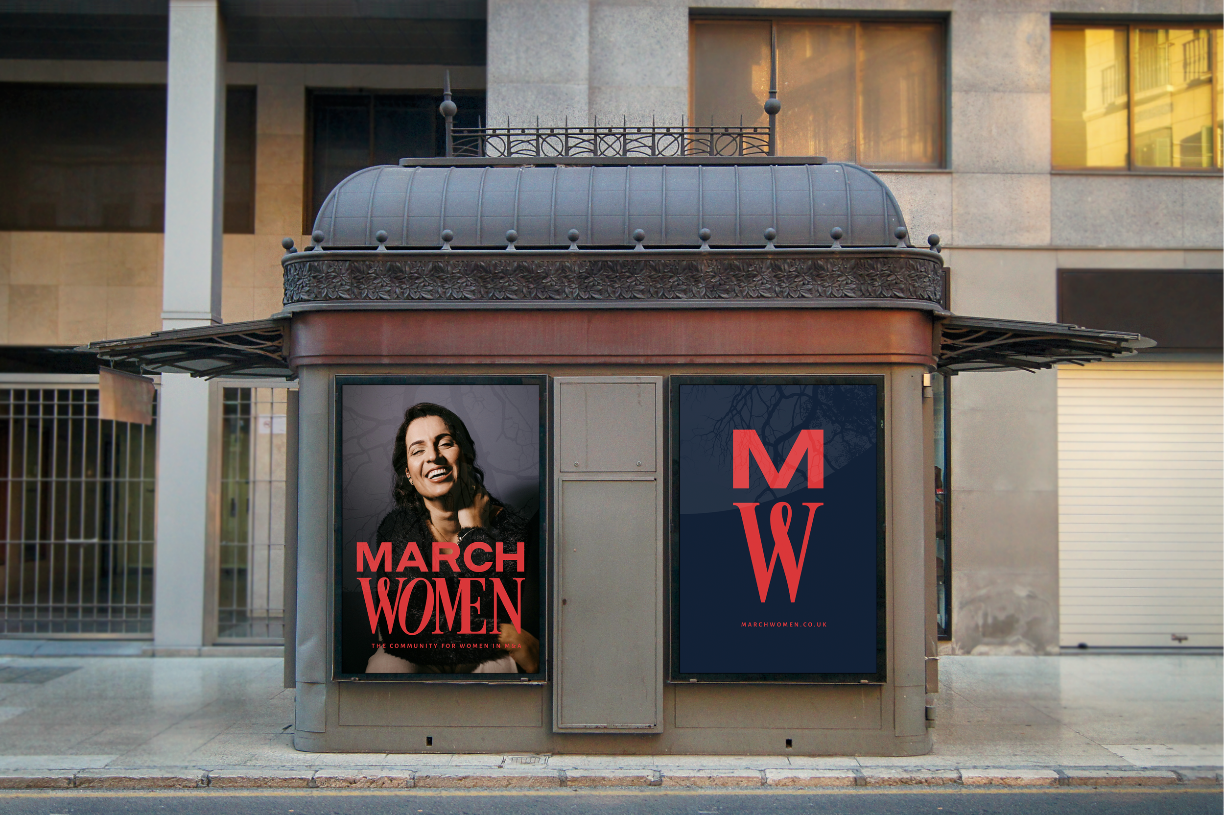
The design elements were carefully curated to reflect the group's commitment to action, collaboration, and sophistication.
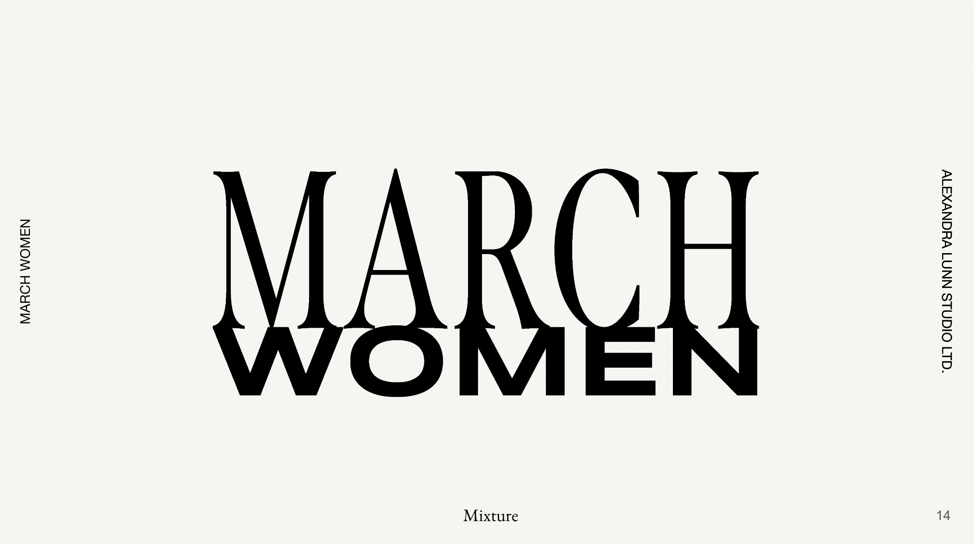
The layering of clean, modern typography creates a visual depth that mirrors the multifaceted nature of the women in the group.
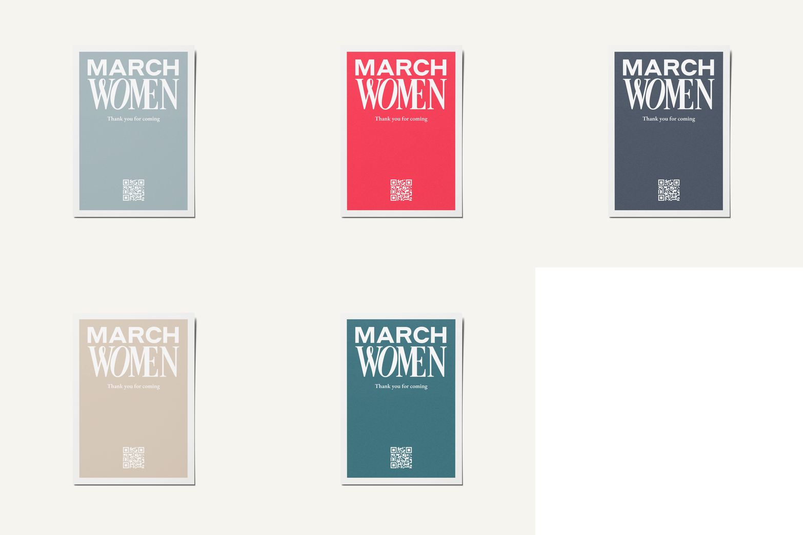
Once the basic brand identity had been established, imagery was selected to capture empowerment and professionalism, showcasing diverse, action-oriented visuals that resonate with the group's mission.
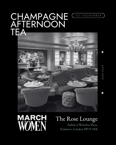
Take a look at how their new brand identity is implemented within their website and LinkedIn page.
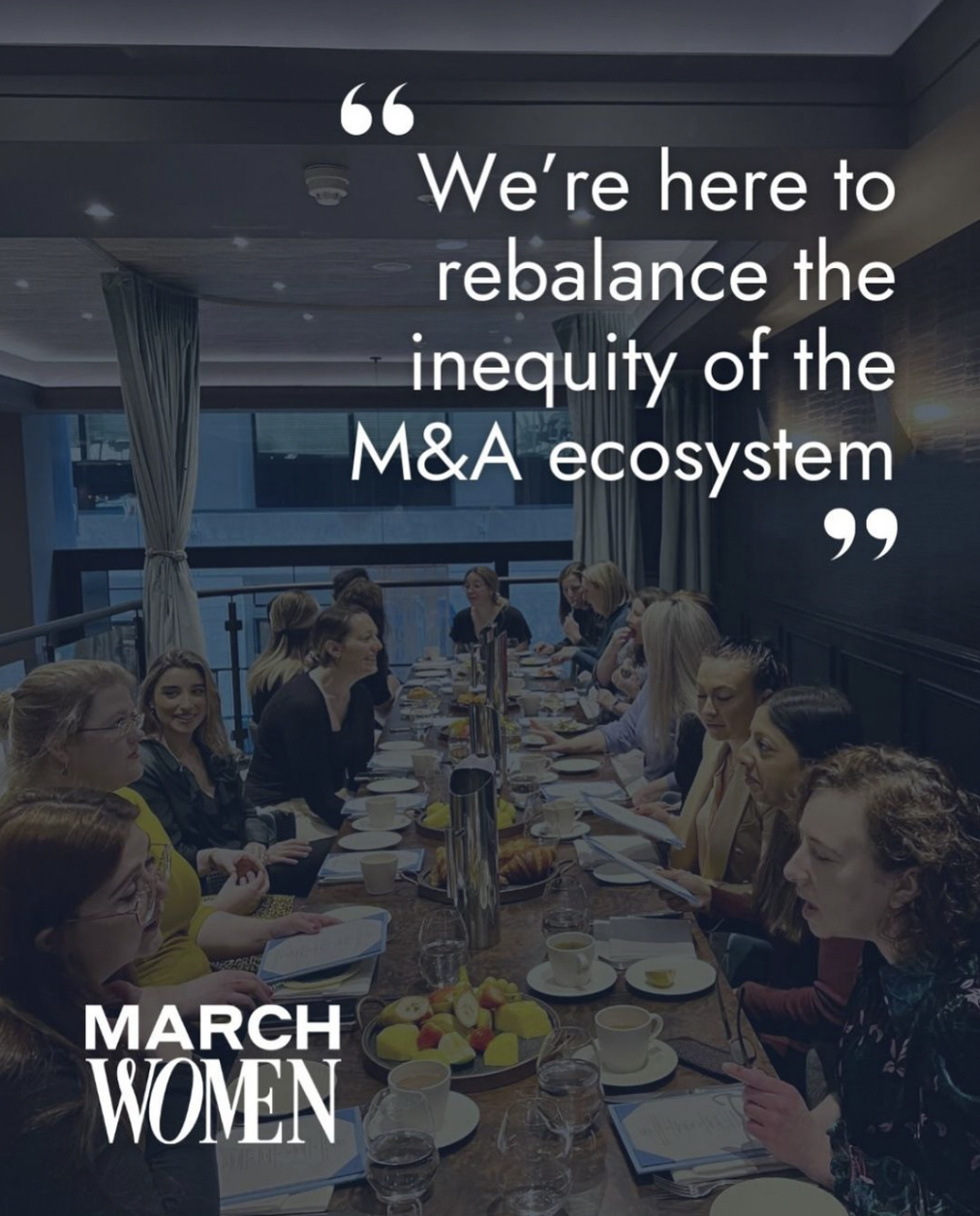
A rebrand aims to keep an existing audience engaged while revamping a usually outdated look and feel to ensure that the new brand identity reflects the business’s values while attracting a new audience. To the left you can see examples of how the previous brand identity looked.
Below we walk you through the transformation of March Women, a community that collectively work towards levelling the playing field and reshaping the future of deals, within the M&A ecosystem.
Laura invested in our MVP package, with extra add–ons. Learn more about our packages here.
Any brand identity design begins with a research phase where we immerse ourselves in the world of the business/brand. It allows us to understand the theme of the thing we are designing around.
The goal for March Women was pretty straightforward: give the existing brand a bit of a facelift to make it more appealing and sophisticated, for the businesswomen of March Women. Laura's strategy was guided by her principle of "less talk, more action." It required a brand identity that communicated effectively through its design and aesthetic.
To get the ball rolling, we shared our brand questionnaire with the founder. Before going through different styles and ideas, we first of all hosted a brand strategy session with Laura and her team that allowed us to all really understand what Laura was after. The thing that kept coming up was her philosophy, which emphasised efficiency, straightforwardness, and concrete outcomes in business transactions (or getting things done).We knew from the outset that this would require a visually meaningful brand representation.
In developing the brand identity for March Women, we worked with Laura and the team to come up with different research and typographic options that served as a benchmark style – to communicate how March Women is a different brand than other women–led networking groups.
We got to work first of all on various type studies, combining both classical and contemporary fonts.


